Why do we need a visual identity?

A graphic profile has been developed to give Marbase an identity, and with that guidelines on how to use the graphic profile elements is produced. Guidelines ensures that anyone who prepares marketing material on behalf of Marbase follows the same rules and uses the same elements correctly. With consistent use of this guideline, we aim to build a strong identity for our company.

Logo

Consistent use of the Marbase logo across all channels, both externally and internally, is a key factor to strengthening the brand. Therefore it is important to follow the guidelines.

The Marbase logo in colour is favoured. Use the logo, on light, preferably white background. Beware of placing the logo on dark backgrounds and over other elements as this can make the contrast too small.

Black and white versions of the logo are available if necessary.

Spacing and size

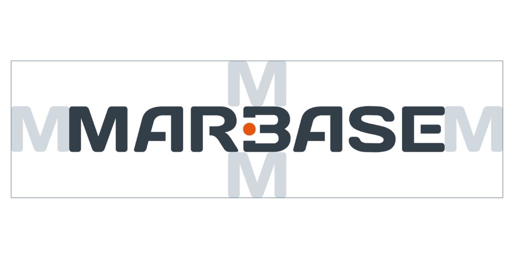
Exclusion zone

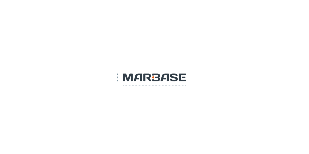
It is important that the logo has enough space to “breathe”. So make sure that text and other elements do not crowd the logo, by staying outside the exclusion zone.

Minimum reproduction size

To make sure the logo is readable and visible, the logo should never be smaller than 10 mm height and 30 mm width.

Exclusion zone

Minimum size

Incorrect use of the logo

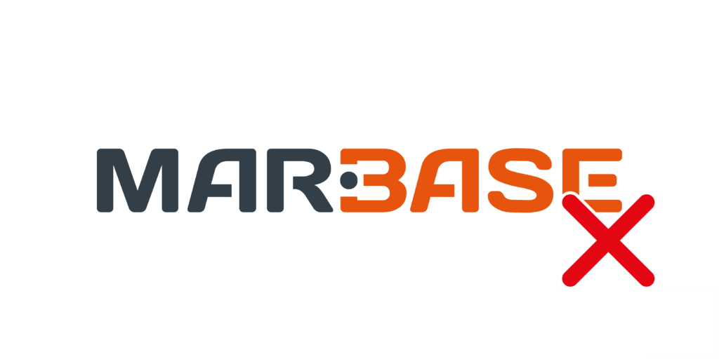
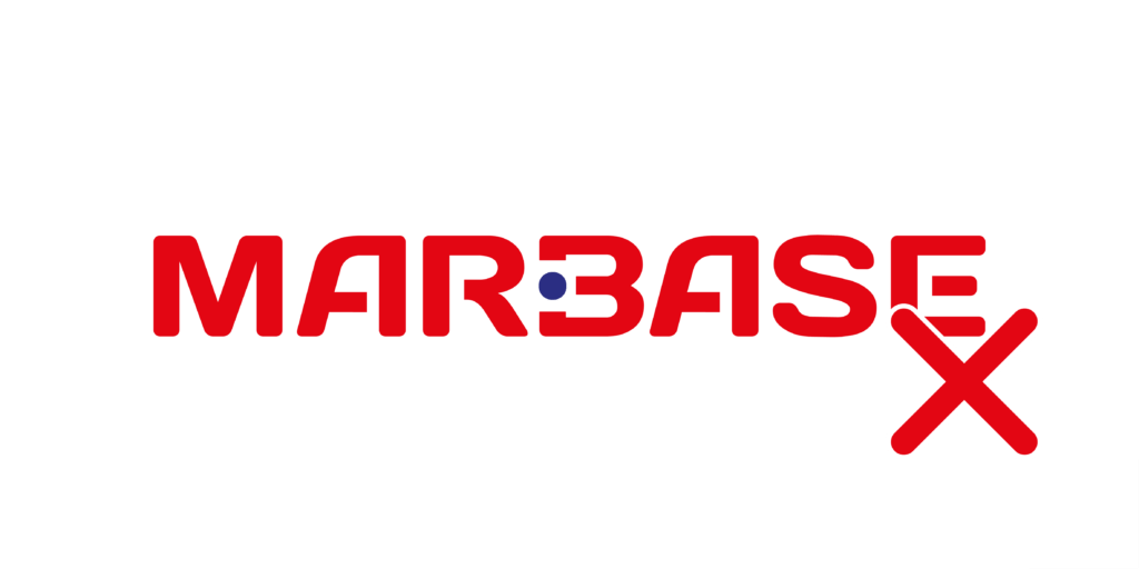
Logo usage don’ts:

  • Do not change proportions of the logo or its elements.
  • Do not add any other colors to the logo.
  • Do not make the logo duotone.
  • Do not add a slogan, or text underneath the logo.
  • Do not use the logo with a box around it.
  • Do not place the logo on top of any other element if the contrast is too small.

Do not add another color

Do not use other colors

Do not stretch or change the shape

Do not add text

Do not put a white box around the logo

Do not use on a low contrast background

Colors

Colors

Main color

The main color of Marbase is Graphite grey. This color can be used on text and supergraphics.

Graphite grey

PMS 432 C

RAL 7024

Hex #323E48


Additional Colors

The Additional color to marbase is Safety Orange. This signal color is used to create contrast to the main color, and to highlight important information. It is also used on supergraphics and support elements.

Use Pantone or CMYK for print. and RAL for painting and signs.

Use RGB/HEX colors for screen-based viewing, such as webpage, internet and powerpoint.

Safety Orange

PMS 166 C

RAL 2004

Hex #E65303


Color Balance

Colors

På et vanlig oppslag skal forholdet mellom fargene i profilen være tilnærmet slik:

On a layout, the relationship between the colors in the profile should be approximately the same:

  • 65 % white
  • 22 % black (text)
  • 10 % Graphite Grey
  • 3 % Safety Orange

Typography

Typography

Lato: Titles, highlight text and body text.

Lato is a modern geometric sense-serif font that is readable at large amount of body text. It is versatile with a large font family. It works well on print and web. It has a friendly and elegant expression.

Microsoft Office

Lato can be installed on all Mac and PCs, making them avaliable for use in all software. Should you for some reason not have Lato avaliable, then Calibri can be used as a substitute. This is a standard font in all newer versions of Microsoft Office.

An example of the typography in use

Main Title, Lato Regular

Body text, Lato Light. Highlight text with Lato Bold. Lato is a modern geometric sense-serif font that is readable with a large amount of body text. It is versatile with a large font familty, and many withs to choose from. It works well on print and on web, at the same time it has a friendly and elegant expression.
Title Level 2, Lato Bold (slightly larger than body text)

Body text, Lato Light. Lato is a modern geometric sense-serif font that is readable with a large amount of body text. It is versatile with a large font familty, and many withs to choose from. It works well on print and on web, at the same time it has a friendly and elegant expression.
Title Level 3, Lato Bold Italic (same font size as body text)

Body text, Lato Light. Lato is a modern geometric sense-serif font that is readable with a large amount of body text. It is versatile with a large font familty, and many withs to choose from. It works well on print and on web, at the same time it has a friendly and elegant expression.
Highlight text, Lato Italic. It is versatile with more font fonts before same family. (About 1.5 the size as body text, with indentation on both sides.)

Body text, Lato Light. Lato is a modern geometric sense-serif font that is readable with a large amount of body text. It is versatile with a large font familty, and many withs to choose from. It works well on print and on web, at the same time it has a friendly and elegant expression.
Bilder

Graphic element

Graphic element

Dot

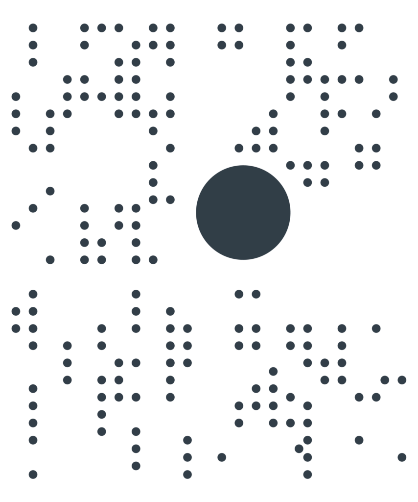
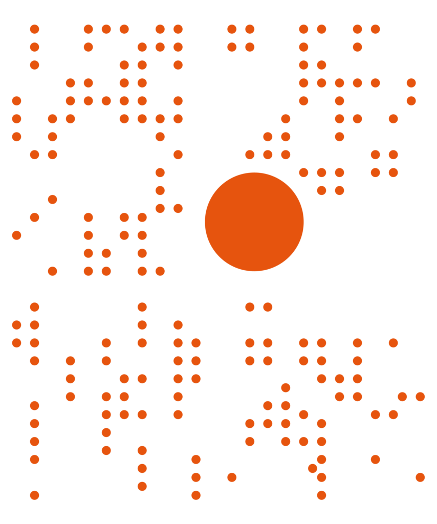
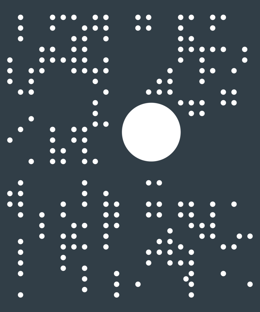
The dot is an element in the logo, when using it as a decorative element the brand itself becomes stronger. This will create association with the logo and the brand itself. The decorative element can be used in the different colors used in the logo, and also in white.

The purpose of the dot is to illustrate Marbase as a centerpiece for all maritime activity. It is important to keep one of the dots bigger then the rest.

It can be used in full sixe, or in a cropped/zoomed version – as long as you can clearly see the big circle.

Powerpoint template

Recruitment

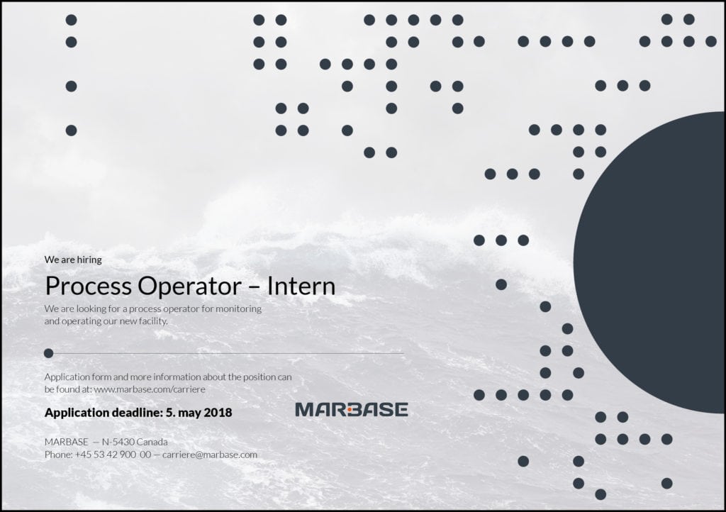
Recruiting

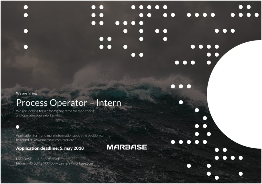
A few examples for recruiting ads, and the use of Graphic element.

Stationaries

Prints

Different printed media.

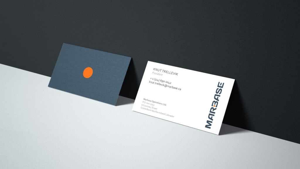
Business card

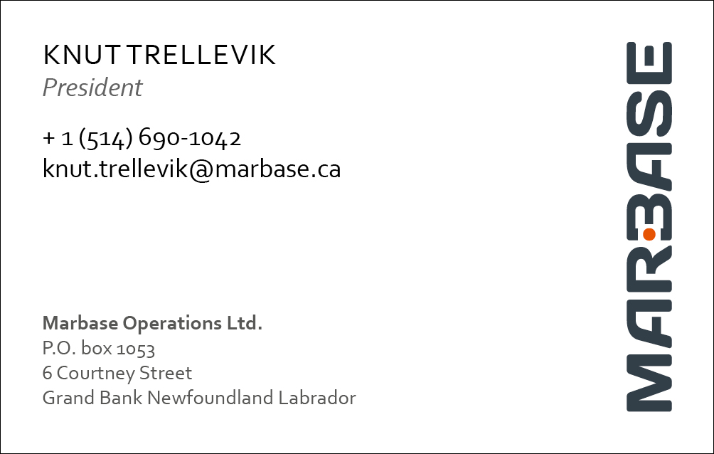
Example of business cards. For files and updating of information, please contact Sydvest.

Letterhead and envelope

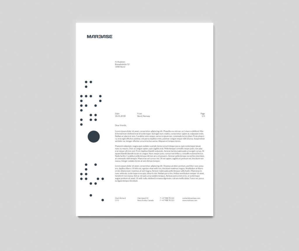
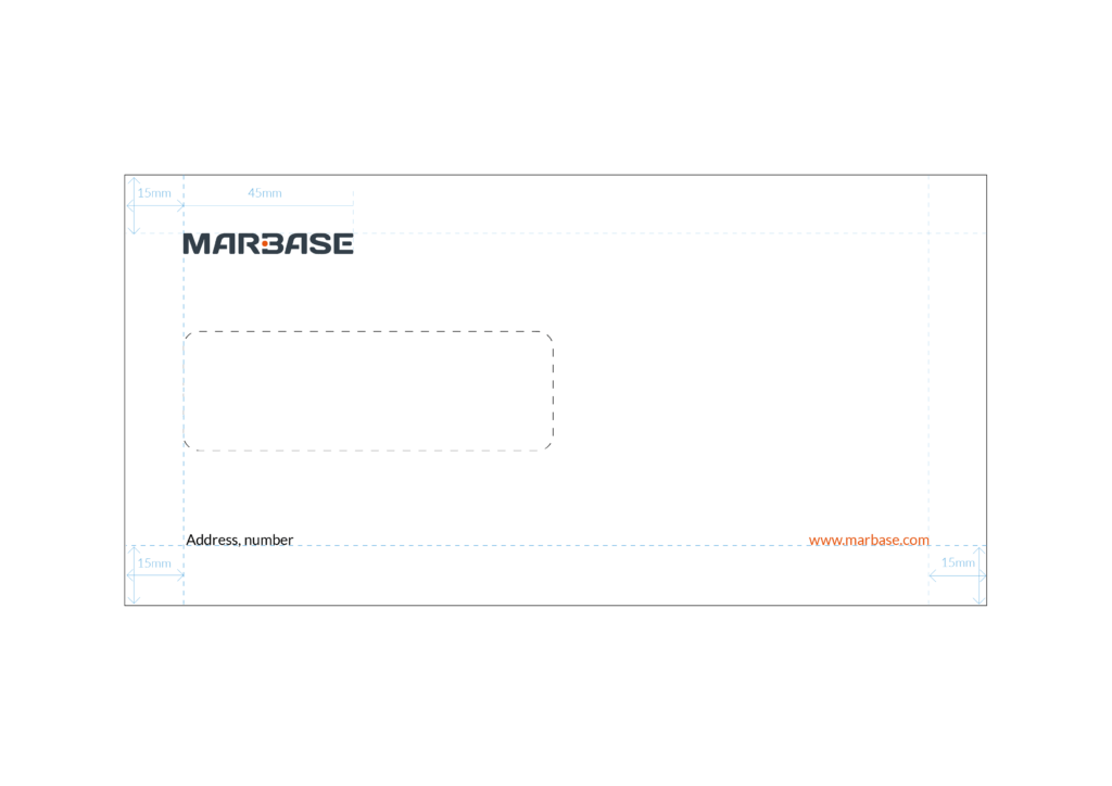
A simple letterhead to be used on all documents.

Queries

For any queries regarding the guidelines shown here, please contact Sydvest AS at post@sydvest.no.